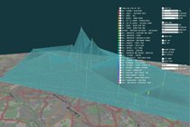
A team of creative media developers based in Tunbridge Wells, Brondbjerg Design & Development, have recently taken on the task of creating a stunning data visualisation showing the daily fluctuations in mean nitrogen dioxide levels across greater London. The source data was recorded during 2011 by the London Air Quality Network at King’s College London.
The idea behind the project was to create a visual 3D representation, as an alternative to existing monitoring data maps and modelled ‘Nowcast’ views that already exist on the LondonAir website.
The linked video shows how variations in air pollution were set to music and used to create a pollution surface which was then laid over a map of London.
London Air Data Visualisation from Mike Brondbjerg on Vimeo.
Item date 18/02/2013
Follow Us
Our newsletter
 Privacy Notice Summary:
- Who this is for: You must be at least 13 years old to use this service.
- What we collect: We store your email address
- Who we share it with: We use "Campaign Monitor" to store it, and do not share it with anyone else.
- More Info: You can see our full privacy notice here
AirMail newsletter
The latest news and research from ERG: View the archive

